Why DIY Website Builders Can Hurt Your Business

A website is more than just a digital business card—it’s often the first place customers decide whether to trust your brand. When you’re trying to build that trust, every click matters. That’s why so many business owners start looking into DIY website builders. They seem easy, fast, and cheap. But the reality is that those tempting drag-and-drop tools will cost your business way more than you realize.

If you’re serious about growth, search engine visibility, and establishing a brand that stands out on the web, you need to think beyond short-term solutions. DIY builders can constrain your website’s performance, damage your SEO, and inhibit your ability to scale. On the flip side, partnering with a professional web design agency in California can unlock real results—helping your business grow stronger, smarter, and more credible online.

In this guide, we’ll walk through why many small businesses regret using DIY platforms, the hidden downsides these tools rarely advertise, and how investing in custom web design services in California can make all the difference. Whether you’re a startup in San Ramon or an established company looking to upgrade, the right web design partner can help you win online—and for the long haul.

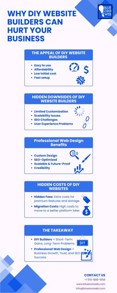
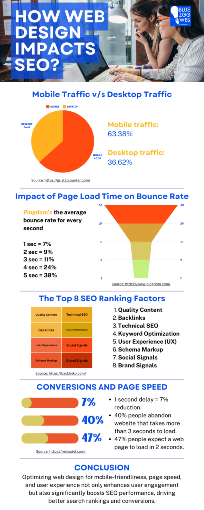
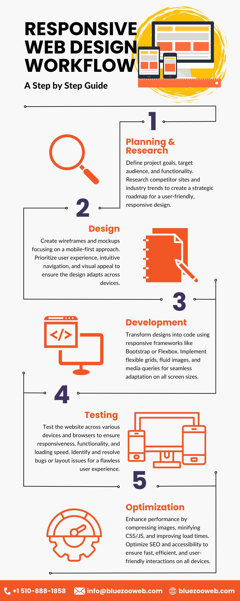
Infographic on Why DIY Website Builders Can Hurt Your Business

1. The Illusion of Simplicity: Why DIY Builders Seem Attractive

There’s a reason so many startups and small businesses are drawn to DIY website builders. On the surface, they look like the perfect solution — affordable, fast, and incredibly easy to use. Who wouldn’t want a drag-and-drop editor that promises a live website in just a few hours? It sounds like a dream… until reality hits.

But let’s unpack this illusion.

I. Low Cost (At First Glance)

DIY platforms advertise free plans or low monthly fees that seem far more manageable than hiring a professional. For a small business trying to stretch every dollar, this appears to be a no-brainer.

The catch? The “free” or budget-friendly tier rarely includes what businesses actually need:

  • A custom domain
  • Extra storage or bandwidth
  • E-commerce features
  • Advanced integrations

Once you start adding those essentials, your budget-friendly website isn’t so budget-friendly anymore.

Companies looking for real value often end up investing in web design services that offer scalable, feature-rich solutions with no hidden costs. Learn more about the true cost of an affordable website for small business here.

II. Ease of Use and Quick Setup

No coding? No problem. That’s the marketing message. DIY builders highlight their drag-and-drop tools that require no technical knowledge. And for simple portfolios or one-page resumes, they do the job.

But when you’re a real business — selling products, collecting leads, managing bookings, or offering services — things get more complex fast.

  • You hit design limitations.
  • You discover that integrations are clunky.
  • You struggle to make the site look and feel “professional.”

Compare that with working alongside a website design company for small businesses, where every feature is built for your exact needs and goals.

III. Fast Launch = Instant Presence?

DIY platforms give you a website fast — but not necessarily a website that works for your business. A pretty page online doesn’t equal online success.

Here’s why:

  • Fast builds often skip critical setup steps: SEO, mobile responsiveness, and speed optimization.
  • You end up spending more time trying to fix issues later than you would have spent building it right from the start.

Partnering with a San Ramon web design expert means your site is built on a solid foundation — fast and effective, not just fast and fragile.

IV. The “Easy” Path Isn’t Always the Smart Path

The real issue with DIY builders isn’t what they give you — it’s what they don’t. They don’t offer strategic guidance. They don’t understand your customers. And they don’t evolve with your business.

Yes, it’s tempting to save money upfront. However, for companies looking to grow, attract customers, and compete online, the shortcut often turns into a setback.

While DIY platforms may seem cost-effective initially, it’s essential to understand the comprehensive steps involved in building a small business website. This guide outlines key considerations to ensure your website supports long-term growth.


2. What They Don’t Tell You: The Hidden Limitations of DIY Builders

DIY website builders promise convenience — but what they don’t show in their ads is the long list of limitations hiding behind drag-and-drop features and prebuilt templates. These platforms are made for hobby sites, not businesses looking to grow, scale, and compete online.

If you’re building a business — not just a basic online presence — here’s what you need to know before trusting a tool that sounds too good to be true.

I. Your Brand Ends Up Looking Like Everyone Else

DIY builders rely on mass-produced templates. Sure, you can swap a few colors or fonts, but the core structure remains the same — and likely identical to hundreds of other websites.

  • You risk blending in, not standing out.
  • Templates restrict layout, animation, navigation, and branding customization.
  • Businesses that want to make an impression need more than a “close enough” design.

A leading web design agency doesn’t start with a template. They start with your goals, your story, and your customer’s experience — and design everything around that.

II. You’re Limited by the Platform’s Rules

Most DIY platforms are closed systems. That means you can’t:

  • Add custom functionality (like advanced booking forms or CRM integrations).
  • Optimize code for performance or SEO.
  • Easily export your website and move it elsewhere.

You’re locked into their ecosystem — and if their tools don’t support what you need, you’re stuck or forced to pay for costly workarounds.

These restrictions can severely limit your visibility online. Here’s a closer look at how web design impacts SEO and why custom-built solutions outperform DIY platforms.

III. Customization Hits a Wall (Fast)

Want to create a custom checkout flow for your online store? Add advanced filters to a product catalog? Embed personalized video sections? Good luck.

DIY builders weren’t made for complexity — they were built for simplicity. And that simplicity becomes a problem as soon as your business starts to grow.

With expert web design services in California, functionality is shaped around your business model — not forced to fit into a rigid template.

IV. You’re the Designer, Developer, and IT Support

These platforms may seem user-friendly, but as soon as something breaks — you’re on your own.

  • No dedicated support team
  • No personalized guidance
  • No strategic roadmap

Compare that to working with web design firms in California that bring strategy, design expertise, and long-term support. They don’t just hand you a website — they help you build a digital experience that drives results.

To delve deeper into how user experience impacts web design, consider this comprehensive overview. It emphasizes the importance of intuitive navigation and responsive design in retaining visitors and enhancing conversions.


3. Built to Break — Why DIY Sites Don’t Scale with Your Business

At first, DIY website builders feel like a shortcut — a fast way to launch and get something online. But when your business starts growing, these platforms show their limits fast. Features that once seemed “good enough” become major bottlenecks, and upgrades either cost more or aren’t possible at all.

Here’s why DIY sites often break instead of scale when your business takes off — and why serious brands turn to a professional web design agency in California to build for the future.

I. Limited Functionality Becomes a Barrier to Growth

What works for a basic site won’t work when you need to:

  • Add a customer portal
  • Launch multilingual support
  • Create dynamic filtering or search systems
  • Integrate complex payment or booking systems

DIY platforms often lack these advanced features — and even when they offer them, they come with restrictions, bugs, or performance issues.

With a custom-built site from a web design agency company, these systems are designed from the ground up to match your goals — no plugins, no hacks, no compromise.

II. Integration Options Are Shallow or Missing

Scaling a modern business often means connecting your website to other tools:

  • Marketing platforms (like Mailchimp, Klaviyo, or HubSpot)
  • Inventory or ERP systems
  • Analytics platforms
  • Payment gateways
  • CRMs and automation workflows

Most DIY builders offer basic integrations — but when your tech stack grows, they can’t keep up. You’re forced to either abandon key tools or try clunky workarounds.

A web design company in California ensures these tools are built into your site architecture seamlessly — no band-aids needed.

III. Performance Tanks with Growth

  • More pages = slower load times
  • More traffic = increased server strain
  • More features = bloated code and longer response times

DIY platforms are designed to work for small websites with light traffic. If you get featured, launch a campaign, or grow your user base? Expect lags, errors, or even full outages.

That’s why scalability should never be an afterthought. With professional web design services, your site is optimized for speed, stability, and traffic surges — whether it’s day one or year five.

IV. You’ll Eventually Need to Rebuild
Here’s the trap:

  • You start on a DIY platform thinking it’s cheaper.
  • You grow — and hit a wall.
  • You now have to hire a team, migrate your content, redesign everything, and rebuild from scratch.

The time and cost of switching platforms later can be much higher than just starting with a solid foundation. If you’re already feeling those limitations, here are the top reasons why businesses pursue a website redesign in 2025.

A website design company for small businesses can build a scalable site that grows with your brand, saving you from expensive do-overs later.

V. Scalable Web Design Starts with the Right Foundation
If you’re serious about digital growth, your website should support that momentum — not hold it back. DIY builders might be fine for quick setups, but when it comes to performance, functionality, and seamless integrations, they rarely keep up.

That’s why growing businesses partner with professional web design agencies that understand scalability, UX, and future-proof development. A well-built site is not just a digital storefront — it’s a growth engine.

Understanding the significance of user experience in modern web design can provide insights into creating scalable and user-friendly websites. This resource discusses key elements and benefits that contribute to effective UX design.


4. SEO Struggles — Why DIY Websites Often Fail to Rank

Your website may appear nice, but if nobody can find it on Google, it’s not doing its job.

DIY website builders typically guarantee an “SEO-friendly” experience — but the truth is much less promising. Here’s why:

I. Bloated Code Slows Down Your Site

Many drag-and-drop platforms generate messy backend code. Search engines like Google value clean, efficient code. When your site is loaded with unnecessary scripts and stylesheets, it slows down — and speed is a direct ranking factor.

II. Lack of Control Over Technical SEO

Most DIY platforms offer only basic SEO settings:

  • Limited meta tag customization
  • No access to robots.txt or sitemap files
  • Poor URL structure (e.g., yoursite.diyplatform.com/page123)
  • No options for canonical tags or schema markup

These missing tools make it harder for your site to rank for competitive keywords — especially when you’re targeting local traffic or specific services.

III. Mobile Optimization Isn’t Truly Mobile-First

Just because a site “looks okay” on mobile doesn’t mean that it’s designed for mobile-first performance. Google now employs mobile-first indexing, which means the mobile version of your site is given priority in rankings. Many DIY templates fail here, with:

  • Poor touch responsiveness
  • Unreadable fonts on small screens
  • Slow performance on mobile devices

IV. Content Hierarchy and On-Page SEO Limitations

DIY builders restrict how you structure content. Headers (H1, H2, etc.), alt text, internal links, and keyword placements are often simplified or hidden behind clunky interfaces. That puts your site at a serious disadvantage when trying to build topical authority or relevance.

V. Lack of Analytics and Insights

Without the ability to install advanced tracking (like Google Tag Manager, custom events, or third-party tools), you’re left guessing what works and what doesn’t. Smart SEO requires data — DIY platforms often fall short in offering deep insights.

Want Your Website to Rank? You Need the Right Tools — and Expertise

Climbing to the top of search results doesn’t happen by accident. It takes technical precision, smart content strategy, and a platform that gives you control — not constraints. That’s why successful businesses turn to experts who understand how to build with SEO from the ground up.


5. User Experience Flaws — How DIY Sites Lose Customers Fast

Getting people to your site is just the first step. The real challenge? Keeping them there.

Many websites built using DIY platforms fall short of delivering a smooth, intuitive experience — and that can cost you customers. Here’s how:

I. Clunky Navigation = Confused Visitors

When users land on your site, they want answers fast. DIY templates often come with:

  • Overloaded menus
  • Unclear navigation labels
  • Poor mobile menu performance

If visitors can’t find what they’re looking for within a few clicks, they bounce — and probably don’t come back. For a deeper understanding of how user experience influences website effectiveness, this article explores the critical role of UX in web design. It highlights how intuitive design can lead to increased user engagement and satisfaction.

II. Generic Design Feels Cheap

Your website is your digital storefront. If it looks like hundreds of others, visitors won’t remember you. DIY platforms rely on the same set of overused templates, which can:

  • Make your brand blend in
  • Undermine your credibility
  • Give the impression you cut corners

In a crowded market, standing out matters.

III. Slow Load Times Kill Interest

People expect websites to load in two seconds or less. Anything more, and they start leaving. DIY platforms often load slowly due to the following:

  • Bloated themes
  • Third-party scripts
  • Poorly optimized images

And when speed drops, so does engagement.

IV. Inconsistent Experience Across Devices

Users browse from laptops, tablets, and phones — and they expect to have a seamless experience on all of them. But many DIY templates are only partially responsive, leading to:

  • Broken layouts on smaller screens
  • Buttons too small to tap
  • Images that don’t scale correctly

Frustrated users rarely stick around long enough to convert.

V. Missing Accessibility Features

A great user experience includes everyone — but DIY sites often fail to meet basic accessibility standards. That means:

  • No alt text for images
  • Poor color contrast
  • Inaccessible forms

This not only leaves out users with disabilities but can also open you up to legal risks.

A Great Website Doesn’t Just Look Good — It Feels Easy to Use

When your website is designed professionally with user experience in mind, visitors linger longer, interact more, and are much more likely to convert. Investing in design that accounts for actual people — their habits, preferences, and needs — pays off where it matters most: trust, satisfaction, and business growth.


6. Looks Can Be Deceiving — The Professionalism Gap of DIY Sites

You might think your DIY website “looks good enough” — but what it says to your customers could be a different story.

Professionalism isn’t just about polished visuals. It’s about trust, perception, and showing your audience that you take your business seriously. Unfortunately, most DIY websites send the opposite message.

I. Template-Based Design Feels Mass-Produced

Even with attractive templates, DIY websites often come across as:

  • Generic and unoriginal
  • Lacking personality
  • Stale compared to competitors

When your site looks like it was thrown together in an afternoon, it tells visitors your brand isn’t invested in standing out.

II. Builder Branding Undermines Your Credibility

Many DIY platforms leave visible watermarks or footers like:

  • “Powered by Wix,”
  • “Built with Squarespace,”
  • “Made with [Free Builder Name]”

These messages act like digital disclaimers — letting everyone know your site wasn’t built professionally. That tiny line at the bottom can plant big doubts in a customer’s mind.

III. Missing the Nuance of Brand Storytelling

Professionally designed sites align design, copy, and structure to tell your unique brand story. DIY sites? They often miss the mark entirely. Without:

  • Strategic layouts
  • Cohesive branding
  • Thoughtful content flow

…your visitors are left piecing together what your brand even stands for — and most won’t bother.

IV. First Impressions Still Matter

In a world where users judge a website in under 3 seconds, perception is everything. A DIY site that looks “just okay” can quickly translate into:

  • “This business may not be reliable.”
  • “They probably cut corners elsewhere too.”
  • “I’ll keep looking for someone more professional.”

People buy from brands they trust. If your website doesn’t look the part, it becomes a silent deal-breaker.

Your Website Should Speak Success Before You Say a Word

When your online presence reflects professionalism, people notice. They’re more likely to stay, trust your services, and reach out. A custom-built, well-thought-out design signals that you’re serious, credible, and worth your time.


7. Budget Myths — The Hidden Costs of “Free” DIY Builders

At first glance, DIY website builders seem like a budget-friendly dream. No developer fees. No upfront costs. Just drag, drop, and launch.

But here’s what they won’t tell you: those “free” or low-cost websites often come with a long list of hidden expenses — ones that can snowball over time and impact your business far more than you expect.

I. Premium Features Are Paywalled

Want more than the bare minimum? Expect to pay extra for:

  • Custom domain names
  • Extra storage and bandwidth
  • Advanced Analytics
  • E-commerce capabilities
  • Email marketing tools

These features are rarely included in the “free” tier — and suddenly, your simple site turns into a recurring expense.

II. Design Limitations Cost You in Brand Value

A DIY site may save you dollars today, but it can cost you:

  • Customer trust
  • Online Credibility
  • Lead conversions

Visitors can tell when a site feels cheap or off-brand. And if it doesn’t inspire confidence, they won’t stick around.

III. SEO and Speed Issues = Lost Revenue

Most DIY builders suffer from bloated code, slow performance, and poor mobile optimization — all of which hurt your search rankings. Less visibility means fewer customers, which directly affects your bottom line.

Free doesn’t mean optimized. And unoptimized means unseen.

IV. Switching Later? That Migration Will Cost You

Eventually, many businesses outgrow their DIY platform. But moving to a professional setup means:

  • Starting from scratch
  • Rebuilding content
  • Reformatting design
  • Reinvesting time and money

A rushed DIY site today could mean a costly rebuild tomorrow.

When You Build for the Future, You Avoid Paying Twice

The budget shouldn’t mean settling. It should mean smart investment. By choosing the right platform and expert team from the beginning, you avoid all the patchwork fixes and upgrades later on.

A professional site doesn’t just look better — it performs better, ranks better, and grows with you.


8. A Tale of Two Businesses: DIY vs Professional Design

Imagine two businesses launching at the same time. Both offer similar services, operate in the same market, and have equally skilled teams behind them. However, one crucial decision sets them apart — their approach to web design.

Business A: The DIY Route

Business A decides to save money upfront and builds its website using a free DIY website builder. With pre-made templates and limited customization, they launch quickly. But soon, the cracks start to show:

  • The site looks similar to dozens of competitors.
  • Pages load slowly and break on mobile.
  • It ranks poorly in search engines.
  • It lacks credibility with visitors.
  • There’s no room for future expansion or custom features.

As traffic grows, the limitations become roadblocks. Customers abandon the site due to slow performance or confusing navigation. Business A ends up hiring developers to patch issues — costing more in the long run than building it right from the start.

Business B: The Professional Advantage

Business B invests in a custom site from a web design agency. Their site reflects their brand, is optimized for SEO, works flawlessly on every device, and is built to scale as they grow.

As a result:

  • Visitors trust the brand instantly.
  • Search engines favor the optimized content and structure.
  • Customers stay longer and convert more often.
  • They add new features with ease — like online booking or custom integrations.
  • Their online presence helps fuel their growth, not hold it back.

Why the Outcome Matters

This isn’t just a hypothetical story. It plays out every day. Businesses that invest in professional web design build lasting digital assets. DIY sites may seem like a shortcut — but they often become a dead-end.


9. What Custom Web Design Gets You That DIY Never Will

Choosing custom web design over DIY website builders is not merely about aesthetics — it’s about constructing a digital framework that serves your business objectives today and in the future. Below are some benefits of professional web design that DIY cannot provide:

I. Tailored User Experience

A custom website is built on your audience’s needs. Navigation, page layout, and each detail are customized to make users’ experience effortless and intuitive — converting casual browsers into devoted customers.

II. Unique Branding

In contrast to generic DIY models, custom design gets down to the personality and values of your brand. This makes your company unique, builds trust, and leaves a lasting impression.

III. Scalability and Flexibility

Professional sites are built to grow. Want to add an e-commerce platform, integrate CRM software, or push marketing campaigns? Custom designs have the flexibility and structure to accommodate new features without having to begin from scratch.

IV. SEO-Optimized Structure

Experts apply clean code, quick loading speeds, mobile responsiveness, and SEO best practices from scratch. This increases your search engine visibility and drives more organic traffic.

V. Better Security and Reliability

Custom solutions often include stronger security protocols and regular maintenance options, reducing risks like hacking and downtime — which DIY platforms might not adequately address.

VI. Professional Support

With a web design company, you have access to expert support for updates, troubleshooting, and improvements. DIY platforms typically leave you to manage everything on your own.

Investing in professional web design is an investment in the future of your business. It’s the distinction between a website that merely exists and one that works actively towards growth.


10. Choosing the Right Web Design Agency in California

Choosing a web design company is one of the most important decisions you will make for your business. Your ideal partner will revolutionize your online profile, enhance the user experience, and fuel expansion. But what do you know about finding that ideal agency that is right for you? There are some significant things to watch out for in selecting a web design company.

I. Experience and Portfolio

Search for agencies with a successful background in developing websites like yours — e-commerce, service-based, or corporate. A solid portfolio indicates their design sense, technical expertise, and capability to address varied client requirements.

II. Local Expertise

An agency based in California means they have knowledge of local market trends, user behavior, and SEO idiosyncrasies unique to your area. This local knowledge can provide you with an advantage over the competition.

III. Range of Services

Web design is merely one part of the equation. SEO, content planning, branding, and ongoing support agencies create a complete solution that maintains your site’s momentum after launch.

IV. Client Testimonials and Reviews

Past client feedback indicates how good the agency is at communicating, delivering on time, and addressing issues. Don’t be afraid to request references or visit independent review sites.

V. Technology and Innovation

The best firms keep pace with the most current design patterns, coding best practices, and optimization techniques. Press them to reveal the platforms and technologies they’re using — scalable and secure?

VI. Budget and Transparency

Clear pricing models and no hidden fees build trust. A trustworthy agency will supply detailed proposals and break down the costs related to design, development, hosting, and upkeep.

By evaluating these factors, you’ll find a web design agency in California that aligns with your business goals and delivers a website that stands out in the competitive digital landscape. If you’re unsure where to begin, check out this guide on how to choose a web design agency for actionable tips and questions to ask.

Ready to Build a Website That Works?

A website is not merely your digital business card — it’s your storefront, your first impression, and, in many instances, your greatest sales tool. Although DIY website builders are tempting as a cheap, fast solution, the long-term compromises in design, SEO, performance, and credibility can cost your business much more money than you’ll save.

If you’re looking for growth, trust, and a professional online presence that truly serves your business objectives, spending money on bespoke web design isn’t just more intelligent — it’s necessary.

Here at BlueZoo Web, we assist companies in California and beyond in creating bespoke websites that are not only stunning but designed to deliver — quickly, search-engine-optimized, scalable, and specific to your brand.

Let’s discuss your goals for your website. If you’re launching, re-launching, or expanding — we’ll assist you in doing it right the first time.

Best Websites for Web Design Inspiration: Brilliant Examples to Boost Your Creativity

Every web designer understands the experience of trying to come up with that ideal design while gazing at a blank screen. Whether you’re a leading web design agency or an individual designer inspiration is essential whether your project is personal, a client website, or just a means of keeping ahead of the curve. In the often-changing field of web design, one may easily get lost or uninspired, particularly for a website design company for small business looking to cater to diverse needs. The best web design samples thus originate from this area since they can inspire your imagination and give new direction.

Some of the best exhibiting exceptional websites for web design will be discussed on this page. We will dissect the main components that set them apart and demonstrate how you may use these models to motivate your own work. These websites are ideal for everyone wishing to remain current on the newest design trends, regardless of size—web design agency or merely a starting point.

Why Web Design Needs Inspiration?

Maintaining inspiration is essential for being relevant in the fast-paced field of web design, not only for overcoming creative constraints. Every year, new technologies develop, user expectations change and design trends shift. Seeking inspiration guarantees that your designs remain up-to-date, interesting, and user-centered. For a leading web design agency, staying inspired is essential for producing creative, user-centered designs.

Benchmarking versus top-notch websites is one of the best approaches you can use to sharpen your web design abilities. Seeing how top web design companies push creative boundaries can open your eyes to new ideas and educate you on how to integrate cutting-edge features into your own work. Furthermore, inspiration keeps you in line with contemporary trends—minimalism, dark mode, interactive storytelling—which are absolutely vital for maintaining the attractiveness of your designs to modern consumers.

Best Practices for Locating Web Design Inspiration

Great inspiration for web design comes from more than merely surfing arbitrary websites. Knowing where to search and how to organize your inspiration can help you to truly inspire yourself. Here are some pointers to enable you to efficiently compile original ideas:

Look over Design Galleries: Masters of web design abound on sites like Behance, Dribbble, and Awwwards. Even a small business web design services provider can gain ideas from these platforms. They highlight the greatest work from leading web design companies, therefore facilitating the identification of unique projects and creative design features.

Bookmark your favorites: Track the websites for web design and initiatives that pique your curiosity. This means you have a go-to list to review when you need ideas.

Look at Design Influencers: Many outstanding web designers publish their work on blogs and social media. Following design influencers can benefit both freelance designers and a website design company for small business looking to remain competitive, gives you direct access to their method and ideas and helps you to remain current on new trends.

These sites are learning venues as much as inspiration sources. Examining the designs, user experiences, and functioning of top-notch websites will help you to better grasp how to include these aspects in your own work.

Top Websites for Inspiration on Web Design

Let us now explore some of the top sites to find motivating web design samples. Everyone has certain qualities that can assist you in improving your design process.

Minimalist Web Design: Awwwards

Design Focus: Awwwards displays the best minimalist designs with simple layouts, lots of white space, and condensed user interfaces.

Suggested Use: Ideal for designing websites emphasizing content without overloading customers with intricate design features is suggested use. Perfect for creating an affordable website for small business clients who value simplicity and clarity.

E-Commerce Website Design: Apple

Design Focus: Apple’s website has a slick, modern design with strong product images and an easy shopping experience. E-Commerce Website Design This is a fantastic e-commerce site that keeps simple navigation yet centers the products.

Suggested Use: For companies in e-commerce trying to offer upscale goods. Apple’s website shows how to boost conversions with well-chosen high-quality pictures, seamless animations, and basic yet powerful call-to-action buttons. Ideal for a web design service agency working on upscale product sites.

Creative Portfolio Website: Behance

Design Focus: Behance gives creative professionals a neat and visually arresting stage on which to present their portfolios. Large images, simple navigation, and easy project access take the front stage.

Suggested Use: Perfect for graphic designers, photographers, illustrators, and other creative workers requiring an online portfolio stressing their work is suggested use.

Corporate/Business Website Design Sample Website: Airbnb

Design Focus: One amazing example of a corporate website with a perfect user experience is Airbnb’s website. It is welcoming, aesthetically beautiful, and straightforward. It stands out for using strong calls to action, crisp typeface, and big graphics.

Suggested Use: Companies that have to construct a professional, customer-oriented website that stresses their offerings and fosters confidence with possible customers. Fit for global brands, service-based organizations, and real estate firms. A great reference for a website design company for small business aiming to create professional and engaging layouts.

Interactive web design: Trent University’s

Design Focus: Trent University’s website exhibits dynamic animations and interesting interactive components with a design focus. To enthrall the viewers, this site employs interactive maps, scrolling effects, and movies.

Suggested Use: Ideal for non-profits, businesses, or educational institutions looking to keep guests interested, interactive, immersive material is suggested for use. It’s perfect for narrative, involving prospective pupils, or interactive product display.

Nonprofit/Community-Oriented Online Platform: Donations: Water.

Design Focus: Donating: Water To connect with guests, water uses a clean, emotional design with big visuals, strong narrative components, and basic navigation. The emphasis is on motivating action by use of striking images and donation appeals.

Suggested Use: For nonprofit organizations, charities, or community-based projects depending on donations that demand a design encouraging trust and involvement.

Design for Blog/Web Magazine Pages: Medium

Design Focus: Medium provides a minimalist, content-centric design with an eye for typography, readability, and clean visuals. It emphasizes interesting pieces and has a good mix of white space and orderly parts of the material.

Suggested Use: Perfect for bloggers, authors, and media companies looking to provide a venue where long-form material is navigable and easily readable. It’s perfect for personal blogs or online magazines emphasizing narrative.

Landing Page Design: Unbounce

Design Focus: Unbounce’s landing page designs are a straightforward model that is best for conversion. Unbounce emphasizes guiding customers toward a single call to action using simple forms, clear headlines, and few distractions.

Suggested Use: For companies wishing to design high-converting landing pages for lead generation, marketing campaigns, or product introductions

Mobile-First Web Design: Instagram

Design Focus: Instagram’s mobile-first design is simple and best for small screens; it features quick load speeds and easy-to-scroll information. Whether on a laptop or a mobile device, the app-like design presents an easy user experience.

Suggested Use: For websites aiming at mobile-first consumers like social media platforms, e-commerce, or news outlets or those needing to give mobile responsiveness first priority.

One-Page Web Design: One Page Love

Design Focus: One Page Love specializes in visually arresting and easily navigable one-page website designs, so their design focus is one page. Usually including parallax scrolling, expansive background pictures, and fast load times, the designs have

Suggested Use: For startups, portfolios, events, or personal projects where you wish to leave a lasting impression without overwhelming readers with too many pages,

Additional Resources for Web Design Inspiration:

Dribbble

Design Focus: Dribbble is a further source of inspiration for web designers. Dribbble is a forum for UI/UX designers to present their original ideas. The design focus here is Interactive web design projects, animations, and ideas abound that could inspire new ideas for your own work.

Suggested Use: Ideal for web designers seeking innovative design trends, animations, and distinctive UI/UX features is suggested use. Perfect for creating interactive, modern, design-style, user-friendly websites. Whether you’re an individual designer or part of a leading web design agency, Dribbble can spark ideas for unique UI/UX elements.

SiteInspire

Design Focus: SiteInspire curates a selection of simple, modern web designs with easy-to-use filters to search for particular design styles, therefore guiding their design focus. It features a rather large range of excellent, user-oriented site designs.

Suggested Use: Designed for all kinds of websites, the suggested use is for discovering neat, contemporary, and professional designs. SiteInspire is ideal for finding the most recent trends in the site design if you wish for ideas for your next project.

CSS Design Awards

Design Focus: The CSS Design Awards concentrate on imaginative web designs employing innovative CSS techniques. Sample Website: With an eye toward user experience and engagement, the website is bursting with creative web designs that challenge current web development standards.

Suggested Use: For creative, inventive websites with amazing CSS and animation skills and expert web designers seeking applications requiring significant interaction or animation, this is a fantastic source.

Best Website Gallery

Design Focus: The best website gallery offers a straightforward collection of amazing websites displaying numerous design elements, including typeface, animation, and responsive design. Moreover, helpful for finding certain components is the tagging system of the site.

Suggested Use: Perfect for designers looking for a well-chosen collection of web design samples ranging from simple to sophisticated designs. It’s a fantastic tool for finding inspiration for an affordable website for small business or any other creative project.

Important Design Trends to Spot in 2024

Web design keeps developing as we enter 2024. The following trends will help to define web design going forward:

Minimalism: Simple, neat designs with lots of white space still find demand. Minimalism lowers clutter, therefore improving user experience and making webpages simpler to explore. Minimalism is an excellent choice for small business web design services seeking to create user-friendly, cost-effective websites.

Dark Mode: Offering a substitute for the conventional light background, dark mode has grown in popularity on websites trying to exude a clean and futuristic vibe.

Micro-animations: By increasing a website’s interactivity, little animations might improve user experience. Micro-animations give a whimsical touch without overpowering the user from hover effects to loading animations.

3D Graphics: Web design’s increasing use of 3D components in 3D graphic-based websites helps to produce more dynamic and immersive user experiences.

Investigating these trends via inspirational websites will help you to keep ahead of the curve and include the newest ideas in your own work.

How Should These Concepts Apply to Your Own Web Design Projects?

It’s time to start using some amazing sources of web design inspiration you have investigated now. Here are some ideas on including inspiration in your own web design projects:

Juggling Originality with Objective: Although it’s fantastic to play about big concepts, make sure your design stays useful and understandable. Only when it improves the user experience will a beautiful design be successful. For a web design service agency, balancing creativity with functionality ensures designs resonate with users.

Do not copy; innovate instead: Start with inspiration and let your own creative ideas flow naturally. While it’s okay to borrow ideas from past designs, be careful to give things your own special spin.

Test and iterate: Test how new design features work as you include them. Excellent design should enhance user experience in general in addition to making it look excellent.

Applying these ideas will help you produce aesthetically pleasing but also functionally and user-centered web designs.

Finally

Any site designer would benefit much from inspiration. Investigating the websites and tools we have featured in this post can help you get a lot of original ideas for your next project. Great website design is about crafting an experience that users will connect with, not only about appearance. Whether you work on a personal project or a web design agency, referencing the greatest web design materials can keep you current.

Frequent exploration of these materials will help you to constantly challenge your creative capacity. Whether you’re a leading web design agency or a website design company for small business, drawing from top resources can keep your designs fresh and engaging.

Why UX Should Be Central to Your Web Design Strategy

Excellent User Experience (UX) design occurs when you visit a website that is aesthetically pleasing and functionally efficient. Although you might not consider it, behind-the-scenes considerable planning goes into building a website that looks fantastic and runs perfectly. UX enters here, and it’s something any company cannot afford to overlook. Whether a small local company or a big one, centering UX in your website design approach will significantly enhance visitor interaction with your website, improving business benefits.

What is UX in Web Design?

First, let’s better understand what user experience (UX) means in web design. User experience (UX) is the impression a person gets by engaging with a system. In website design, it refers to ensuring that visitors to your website have a pleasant time on it. UX covers everything from the layout and navigation design to the speed at which the website loads and the ease with which visitors can locate the content they came looking for. There is no successful website that does not have a user experience strategy that is well implemented. In terms of importance, it is on the same level as the aesthetics of the design of your website.

The Impact of Good UX on Website Performance

Improved User Engagement and Retention
Improved user engagement is one of the apparent benefits of optimizing the user experience. Remember that visitors will spend more time exploring if a website is easy to use, loads fast, and has valuable content. For companies who want to turn site visitors into paying customers, providing a better user experience is crucial. Customers will return to your website repeatedly if it has a user-friendly interface. Small business web design services often emphasize creating intuitive user interfaces that cater specifically to the unique needs of small business owners, ensuring repeat visits and customer loyalty. To top it all off, it encourages customers to take some action, be it making a purchase or getting in touch. As a leading web design agency, we have seen this phenomenon firsthand: increased engagement and retention rates following a compelling user experience strategy.

Higher Conversion Rates
UX not only improves the usability of your website, but it can also boost revenue. Users are much more inclined to act if they can discover the necessary information. A website that has been designed with careful consideration may become the deciding factor between whether an individual is a casual visitor or a paying client, whether they are signing up for a newsletter, making an appointment, or making a purchase. If a website design firm prioritizes user experience (UX), they may increase conversion rates and make the sales process easier for visitors.

SEO Benefits of UX-Centered Web Design
Search engines such as Google prioritize user experience. Metrics like page loading speed, mobile responsiveness, and ease of navigation all impact how your website ranks. Websites that are difficult to use, whether due to long loading times or a confusing design, tend to have a decline in search engine results. As a leading web design agency, we understand that integrating UX into design can significantly improve SEO, helping businesses not only rank higher but also deliver a seamless experience to their visitors.

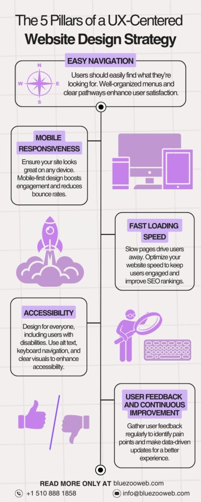
Infographic image on The 5 Pillars of a UX-Centered Website Design StrategyKey UX Elements to Focus on in Website Design

Navigation

Navigation
An excellent user experience starts with simple navigation, a priority for any web design service agency committed to delivering exceptional results. Users who need help locating what they seek in a few clicks will quit your website. Any effective website must have an easy-to-use and straightforward layout. An experienced web design company will prioritize this section to guarantee that users have a flawless experience from start to finish. Small business web design services often pay special attention to these elements, ensuring that small business websites remain efficient, accessible, and appealing.

Mobile Responsiveness

With more people exploring the web on their mobile phones than ever before, having a mobile-responsive website has become essential. Everyone hopes for the same unique experience on mobile devices as desktops and laptops. The ability to adapt according to the different screen sizes is a characteristic of responsive website design. Website design company for small business often emphasizes mobile-responsive designs, ensuring customers have a great experience, no matter their device. According to a web design agency, your website’s responsive design allows users to view it from desktop computers, tablets, and smartphones.

Page Speed Optimization
Nobody enjoys waiting for a web page to load. Pages that load slowly are among the most common reasons consumers quit a website. A web design agency in California that understands the value of UX will always prioritize webpage speed. Boosting your site’s performance can lead to greater search engine ranks, which is great for both users and search engines like Google, which values fast-loading websites. Investing in an affordable website for small business that is both fast and user-friendly will keep your visitors engaged and improve your rankings.

Accessibility
Designing a website so that all users, including those with disabilities, can utilize it is known as making it accessible. Making sure your website can be accessed with a keyboard and including alt-image text in images is necessary to assist visually impaired visitors. Web design services that are comprised and emphasize accessibility can make your website accessible to a larger audience, indicating that you are passionate about providing a fantastic experience for all users.

UX Best Practices to Implement in Your Website Design Strategy

User-Centered Design Approach

A web design service agency focuses on user-centered design, ensuring the website meets the audience’s needs and offers a seamless experience. Think like customers and design the website towards their requirements, wants, and struggles. A website design company for small business can produce a more effective and user-friendly website by thoroughly understanding the unique needs and challenges faced by small businesses.

Conducting Usability Testing
Even the most meticulously planned websites can have problems with user experience. If you conduct usability testing on the site before making it public, you can identify and address issues faster. It can help you check if your website is easy to use and gives the right impression.

Incorporating Feedback Loops
You still have to work on your site after it goes live. Collecting user feedback is a continuous procedure that helps you improve the user experience for everyone. By collecting data from users through surveys, heat maps, or direct feedback, your web design service provider can make informed decisions that will enhance the functioning of the website over time.

Common UX Mistakes in Website Design and How to Avoid Them

Cluttered Layouts and Complicated Designs
Websites with overwhelming content, buttons, or an unclear layout are among our most common problems. Simple can be elegant at times. Website simplicity is paramount. You may improve the user experience and make it easier for users to navigate your site with a clean and simplified structure.

Ignoring Mobile Users
Mobile responsiveness is crucial, as previously discussed, yet it is worth restating. A sure way to lose prospective consumers is to disregard mobile users. Always prioritize a smooth experience for mobile users by working with a web design agency in California that focuses on UX.

Poor Content Structure
When properly structured, content rules are the highest. Users will likely depart if they are required to navigate through mountains of material to locate their desired content. Make your information more accessible to read and discover by organizing it clearly and concisely.

Conclusion

User experience (UX) is an essential component of every successful website design strategy, not merely a trendy term. To improve user engagement, conversion rates, and SEO performance of your website, it would be ideal to base your website design approach around user experience (UX). Whether working with a web design agency or doing the project yourself, you should always keep the user in mind. For small businesses, investing in an affordable website for small business with a strong UX focus can deliver remarkable results, from higher customer satisfaction to improved conversions. This will help you make decisions, resulting in a website that looks great and works perfectly. Putting money into UX now can help your online & offline businesses succeed in the long run.

Why a Well-Designed Website Matters for Your Business

Have you ever abandoned a website due to its poor design or the time its pages take to load? Everyone experiences it once in a while. Just picture what happens to people who might buy from your company online. You risk losing visitors, leads, and money due to a poorly designed website. A well-designed website is not just about pleasing your eye but is also practical and functional for any business trying to succeed in today’s internet-dependent world. A leading web design agency can ensure your website is not just visually appealing but also practical and effective in driving business growth. The best websites don’t only exist; they actively serve your needs. The users landing on the website should be attracted to the design, engaged with interested content, and converted into paying clients. This article will review the main points about how important a professionally designed website is for your company and how it affects your online success.

1. First Impressions Are Everything

People do indeed judge a book by its cover, and websites are no different. In the first few seconds, a visitor spends on your site, you must establish a long-lasting impression. Customers will likely trust your company’s credibility if your website appears professional and well-organized. Collaborating with a leading web design agency guarantees a website that leaves a lasting impression on your visitors. Contrarily, if your website is poorly designed, visitors will doubt your legitimacy and professionalism, and they may even abandon your site altogether before diving into what you have to offer.

This is where web design agencies come into play. With its wealth of experience and knowledge, a professional web design company knows exactly what needs to be done to build a website that represents your business, attracts more traffic, and encourages visitors to take action. Whether you’re an established organization known by millions or just a fresh start-up company, hiring web design professionals can give you the edge you need to stand out from the competition.

2. A Great User Experience (UX) Boosts Engagement

Remember the time when navigating a website was a real challenge? I know it’s annoying. This highlights the critical importance of developing a website that is not just easy to use and understand, but also a pleasure to navigate. For small businesses, investing in small business web design services ensures that their websites are both user-friendly and scalable. Users tend to spend more time on your website if the design offers a good user experience, from good design to easy-to-use, accessible, and useful content. Working with a website design company for small business to large enterprise ensures your website is tailored to your target audience and delivers an excellent user experience.

Also, keep in mind that your website should be responsive. This means it should be able to adapt to different screen sizes. More and more people are accessing the internet using mobile devices, as shown by a study by Statista. A few elements are essential to ensure your visitors have a smooth experience across all devices, such as being user-friendly, mobile-friendly, and loading quickly. To achieve this, you can take assistance from an expert or hire a web design agency.

3. SEO-Friendly Design Helps You Get Found

Let’s just say you have one of the most beautiful-looking websites, which can win an award for best-designed website, but it can be useless if the users or targeted audience can find it on the Search Engine. This is where Search Engine Optimization can come in handy for your business website. An experienced web design service agency can optimize your website for search engines, making it easier for potential customers to find your business online. Optimizing the website as per the search algorithm, user search intent, and other ranking factors that all fall under SEO. Implementing SEO can increase organic traffic and ranking in Search engines and satisfy user experience.

Hiring a digital marketing company means that they will optimize your site for search engines in every way. This includes the structure, content, and images. More exposure for your company, quicker page loads, and enhanced performance on mobile devices. Best SEO Agency in California can also improve a company’s visibility in local search results, increasing the probability that nearby clients may get attracted.

4. Establish Trust and Credibility

The website is a digital representation of your company, the same as the front of your store or business. Your store’s aesthetic and modern look attract foot traffic to the store to buy your product or services; that same is applied to your website; if the design is beautiful, modern, and there, and is disorganized. In that case, all this will automatically repeat any customers, even those who enter your store, regardless of the best product or service you provide. That can be said for your website as well. This discourages potential clients and raises red flags for your business’s credibility and trust factor. A website design company for small business can help you create a professional-looking website that builds trust and credibility among your audience.

If no one wants to stay on the website and get out as soon as possible, it sends negative signals to search engines, as if the website is untrustworthy. You can add some components to the web design to gain customer trust and improve your credibility, like security badges, customer reviews or client testimonials, and proper and clear contact information. This will help satisfy the potential customer’s concerns, and they will trust you; in the end, they might end up purchasing, filling out a contact form, or other call-to-actions on your website.

5. Web Design Drives Conversions

The ultimate goal of your website should be to generate sales. Create a website that guides the customer toward the call-to-actions elements present on the website, but it should not be forced, such as the contact form keeps on popping every few minutes or after every paragraph; you have implemented some sort of submit button or purchasing option. Once the user arrives on the site, they should able to follow specific steps, absorb the information provided, and, in the end, use the call-to-action. With the right web design service agency, you can create a website that seamlessly guides visitors toward key actions like purchases or inquiries.

For this, you can review the user behavior on your website, study more about how to implement call-to-action, or simply hire an experienced web design company. Web Design Company are aware of the significance between CTAs & conversions. This helps them build a user-friendly website and properly placed CTAs; it can be anything from a “Buy Now” button, a “Request a quote” form, or any other type of button or form.

6. Stand Out from the Competition

Do you know what can make you stand out from the competition? The answer is custom web design. It is, so far, the best option to differentiate yourself from the competitor. Templates are convenient and inexpensive but don’t always have the personal touches that set the brand apart. Creating an affordable website for small business doesn’t mean sacrificing quality or creativity.

By working with a web design agency in California, you’ll obtain a website suited to your demands and goals. With the help of a leading web design agency, you can bring the unique characteristics of your brand into the website, increasing the opportunity of attracting a targeted audience. Also, with custom design, you can set yourself apart from the competition, and they might remember you for the distinctive website.

7. Consistency Builds Brand Identity

Your website must adapt to the development of your company. A well-designed website, which is developed with scalability in mind, is created with the potential to adopt future modifications without requiring significant changes in the design. Whether you want to add a new product line, upgrade your services, or implement new technology. A professional web design service agency can ensure your website reflects your brand’s identity consistently across all pages.

Using the services of a web design company in California will allow you to have peace of mind, knowing that your website will be able to accommodate any modifications that may occur in the future. This means you are confident that your business will grow and that you are preparing your website in advance to adapt to your business growth, which, in the long run, saves you both time and money.

8. Scalability for Future Growth

Having a good brand image is important for the business. So, a business website needs to maintain consistency throughout the website. There are a few things to remember, such as the brand logo & other logos, marketing materials, brochures, and social media pages. Keeping up with this degree of consistency will improve user experience and build trust among the users. By opting for small business web design services, companies can future-proof their websites to accommodate their growth seamlessly.

A Web Design company can create a website that goes well together, from the color scheme and font to design elements representing your brand. This helps maintain the design consistency and make the website appear more professional. Partnering with a website design company for small business and all other business size ensures that your brand message is consistent across your digital presence.

Conclusion

Just having a brand website is no longer a luxury for the brand but an essential tool to boost growth. In fact, the website serves as the first impression of your brand, like an astonishing visiting card. The user’s decision to do business with you, buy a product, and enroll in the services you provide can all be influenced by a single website. A well-designed website enhances user experience, improves trust among and improves, and improves credibility in front of search engines. Investing in a professional-looking website is a win-win situation. Hire an expert web design service in California or collaborate with a trusted web design agency in California to create an amazing-looking webpage with a great user experience.

Suppose you already have a website and don’t know whether to redesign it. In that case, we have an article, “5 Signs It’s Time to Redesign Your Business Website,” or you can learn more about responsive web design in “Responsive Web Design Best Practices and Common Mistakes.” You should not undervalue the potential of your website because it is a precious asset to the expansion of your company.

5 Signs It’s Time to Redesign Your Business Website

Introduction

Let’s just Imagine: A person searches for a product or service, finds your website & clicks on your website, and within seconds, they’re gone “puff” — without exploring further, making any purchases, or checking out the services. What might be the issue? It’s your website. In the present day, your website serves as the face of your business. Not just an online brochure or digital model, now it plays a critical role in engaging users, boosting conversions/sales, and building trust among potential customers. But have you thought, “What if it’s failing to do so?” Outdated web design and poor performance can repel users before you even get a chance to make your pitch. Consulting a professional web design agency in California can help to ensure your website is optimized to meet modern standards. A well-designed website isn’t about having a beautiful-looking website; it’s about functionality, speed, and providing an effortless user experience.

Here is the question, “How do you know, if your website need to be redesign?” Let’s us share the five signs that suggest your business website is overdue for a redesign.

Sign 1: Your Website Looks Outdated

Users’ perspective or memory of your brand might be altered by the design aesthetics. I regret to inform you are already losing user interest if your website seems to be trapped in the past. The web design industry is constantly evolving, and what was once regarded as modern is now considered outdated, just like the 80’s fashion trend. Users associate a clean, contemporary website with professionalism and reliability. Partnering with a web design service agency can provide your business with modern, clean designs that boost credibility and engagement. Our team specializes in creating an affordable website for small businesses, ensuring it is not only visually appealing but also functionally optimized for all devices.

First Impressions Matter:
94% of first impressions are design-related:
https://www.sweor.com/firstimpressions

Outdated visual elements like Flash animations, non-responsive page layouts, or fonts that no longer fit today’s minimalist style can discourage users from staying on your site. Additionally, these features make your website feel cluttered, messy, and even harder to navigate around without proper structure, especially on mobile devices. It’s crucial to incorporate design changes as per the trend, such as minimalism, responsive design, and bold typography, to enhance the user experience and strengthen your brand’s credibility.

Design Credibility:
75% of users judge credibility based on website design:
https://www.linkedin.com/pulse/75-users-judge-companys-credibility-based-its-website-71ute

When you redesign your site, work with a skilled web design company, it can give your site a new perspective, like applying a fresh coat of paint, which make a huge difference on how users engage with your business.

Outdated vs. Modern Websites:
90% of people leave poorly designed websites:
https://sagapixel.com/web-design/web-design-statistics/

Sign 2: Poor User Experience (UX)

Good even fantastic user experience (UX) is a cornerstone of any modern web design. For businesses looking to deliver an exceptional experience without breaking the bank, creating an affordable website for small business audiences can be the key to retaining users. A site with poor UX not only frustrate users, who leave before even exploring your products or services, but spoiling you chance of generating leads.

So, what makes a good UX? I can think of a few things: how fast the website is, how easy it is to use, and how responsive it is on different devices. People will leave your site and go to another one if it takes too long to load the first time.

Speed is another crucial factor for user retention that also impacts your SEO rankings. Google uses page speed as a ranking factor, which means that if your site is slow, it may not show up as high in search results.

You can test your website’s speed with tools like Google’s PageSpeed Insights or GTM and identify changes to make it faster.

Page Load Time:
Think with Google – 53% of visitors of mobile sites leave if the page takes longer than 3 seconds to load:
https://www.thinkwithgoogle.com/consumer-insights/consumer-trends/mobile-site-load-time-statistics/

Confusing navigation is another key element of poor UX. If users can’t find what they’re looking for within seconds or have to search on your website, they will get irritated and leave. Similarly, a website that isn’t optimized or organized neatly for mobile use will turn away a large portion of the audience. As more people browse on smartphones, making a mobile-optimized website is non-negotiable.

Navigation and Usability Impact:
88% of users are less likely to return after a bad experience:
https://embryo.com/blog/30-user-experience-ux-statistics-that-you-need-to-know-about-in-2023/

While redesigning a website, you can address all stated issues and improve the overall website performance, user journey, easy navigation, exploration, and conversion.

Conversion Drop Due to Bad UX:
Good UX can increase conversion rates by 400%, while bad UX reduces performance by 40%:
https://www.forbes.com/sites/forbesagencycouncil/2017/03/23/the-bottom-line-why-good-ux-design-means-better-business/

Sign 3: Low Search Engine Rankings

Google and other search engines lean toward websites that provide a good user experience, so the design of a website and how well it does in SEO are likely to be linked. Your search results will definitely go down if your site’s design is old or cluttered. Outdated design elements like poor mobile performance, slow load speed, non-responsive site, bad layout or a lack of internal linking can tank your SEO efforts. To learn more about why SEO is vital for online success, check out The Crucial Role of SEO in Today’s Digital Landscape.

Mobile-First Indexing:
Explanation of mobile-first indexing and its impact on rankings:
https://developers.google.com/search/mobile-sites/mobile-first-indexing

On top of that, modern SEO algorithms like Google’s Core Web Vitals focus on metrics such as load speed, user engagement, and visual consistency—all of which are influenced by your web design. If your website is under-performing in search rankings, that mean’s it doesn’t meet these standards.

Core Web Vitals Impact:
Portent – A 1-second delay in load time can cause a 7% drop in conversions:
https://www.portent.com/blog/analytics/research-site-speed-hurting-everyones-revenue.htm

A redesign website that incorporates the modern SEO strategies, along with latest trends can boost your visibility and help you attract more organic traffic. Leveraging web design services in California can help you implement modern SEO strategies that elevate your site’s performance and visibility, attracting more organic traffic and boosting your business presence.

SEO and Speed:
Neil Patel – Sites that load faster rank better and get 25% more ad views:
https://neilpatel.com/blog/loading-time/

Sign 4: Your Business Has Evolved, but Your Website Hasn’t

Very often, the business model keeps on evolving as time goes on, and so should your website. Your company has grown and changed its focus as per the user requirements, so it is a good idea to update your site, or else there’ll be a mismatch between your current business and your website. Though your website still appears the same as it did five years ago, there’s a chance you introduced new services, extended to new sites, or changed your brand message.

Business Growth and Website Alignment:
Businesses that update their websites see a increase in lead generation:
https://wisernotify.com/blog/lead-generation-stats/

This misalignment can confuse potential customers, leading them to think your business hasn’t kept up with the times or damage your credibility. A website redesign, with the help of a web design agency in California, give you the opportunity to bring your online presence & your business’s on the same page with your current branding. Regardless of whether you need to add new sections, update the website structure, or refine your brand message, a redesign ensures your website reflects who you are today.

Mismatch Between Business and Website:
92% of people said cluttered layouts would make them switch to a competitor:
https://blog.hubspot.com/website/bad-vs-good-design

Brand Consistency:
Consistent branding increases revenue by 10% or more:
https://madebyshape.co.uk/web-design-blog/statistics-facts-and-figures-about-the-power-of-branding-for-business/

Sign 5: Your Website Is Not Mobile-Responsive

Mobile responsiveness is among the key elements; it is no longer optional. It’secessity. A non-responsive website will ultimately cost you visitors, leads, and sales. A website that doesn’t adapt according to different screen sizes frustrates users and is also not appreciated by search engines like Google, Bing, and others. People all over the world now have easy access to the internet through smartphones and tablets.

Mobile Usage Statistics:
54% of global website traffic comes from mobile devices in 2023:
https://www.statista.com/statistics/277125/share-of-website-traffic-coming-from-mobile-devices/

In fact, Google has changed its algorithm and prefers mobile-friendly design; even Google primarily uses the mobile version of the site to index. Websites that don’t pass Google’s mobile usability tests will fall in rankings, even if they perform well on desktop. Your website needs to be mobile-first, so it loads quickly and looks great on all devices if you want to attract today’s audience. This change has made the mobile-friendly design very important for SEO success.

Mobile-Responsive Website:
62% of companies that redesigned to be mobile-responsive saw increased sales:
https://www.ironpaper.com/webintel/articles/10-web-design-statistics

For small businesses, designing an affordable website that is mobile-friendly ensures you can reach the growing audience of mobile users while staying within budget. According to Statista, 95.9% global website traffic comes from mobile phones & 93.7% from smartphones. Ignoring this present trend could result in lost opportunities.

User Preferences:
74% of users will return to a website only if it’s mobile-friendly:
https://userguiding.com/blog/website-statistics-trends

The Benefits of Redesigning Your Website

A website redesign isn’t just a cosmetic upgrade; it can significantly impact your business’s outcome. The most immediate benefit you will notice is it enhance user experience. A modern, user-friendly web design attract new visitors, allow them to navigate easily around the website, increasing the chances of converting them into potential customers.

Stanford found that 75 percent of people think a company’s website design says a lot about its credibility. Making a good impression online is crucial to gaining and earning consumers’ confidence.

Another significant advantage of redesigning website, is boosting SEO performance. Partnering with a leading web design agency can help incorporate modern SEO strategies into your redesign, driving better rankings and increased traffic. Search Engines like Google, Bing, Yahoo & other prioritize websites that load quickly, are mobile-responsive, and offer seamless user experiences. Updating your site and including these features to improve user experience and go along with Search engine Algorithms, you’re likely to see a significant improvement in search rankings. In fact, research by Google shows that sites optimized for mobile are 1.9 times more likely to convert visitors into customers.

Additionally, redesigning your website can help streamline your brand message. A website design company for small business can ensure that your new site aligns with your evolving brand identity while keeping user needs in focus. As your business evolves, your goals and brand identity with develop, and an outdated site with the old version of your business can send the wrong message to your audience. Incorporating professional web design services during a redesign helps align your site, whether it’s new services, updated branding, or refined messaging, helping you stay relevant in your industry.

Finally, a fresh design allows for the integration of modern features like enhanced security protocols, such as SSL certifications, and better website analytics tools. Keeping your site secure, protects your & user data and also gives your users peace of mind, knowing their information is safe. All of these benefits combined make a website redesign a powerful tool for long-term business growth.

How to Get Started with a Website Redesign

While, redesigning your website it might feel like a exhausting & daunting task, but it doesn’t have to be. The very first step is to do research what is currently working in the market, latest trend, as well as what isn’t working or will be harmful.

Start by reviewing your site’s analytics. Tools like Google Analytics can offer great detail insights into user behavior, identifying which pages have high bounce rates or low conversions. Use this data to determine where improvements are needed most—whether it’s page load speed, navigation, or mobile responsiveness.

Next, outline clear objectives for the redesign. Do you want to improve user experience, boost SEO, or better align the site with your brand’s current state? Defining your goals will guide the design process and ensure the changes that are made are effective and planned in advance. For example, if increasing mobile traffic is a priority, you’ll need to focus heavily on a mobile-first design approach.

Hiring a professional web design agency in California is the best way to ensure your redesign is both efficient and impactful. Experienced agencies tend to understand the nuances of modern web design but can also help with SEO and user experience strategies tailored to your business needs. They can assist with everything from UX design to integrating analytics and marketing tools.

Once you’ve partnered with a web design service provider, they’ll conduct an in-depth site audit, understand your needs & also the person of your potential customers and pre, and send a plan for redesign. This process involves mapping out site structure, frames, layouts, and sign elements and testing usability before launch. Remember that a well-thought-out website redesign can take time, but it’s worth it if it leads to higher search ranks, improved user engagement, and more sales.

Web App vs Mobile App – What’s the Difference and Why It Matters

In today’s digital-first world, having an app is no longer optional—it’s essential. But when deciding how to bring your idea to life, the first question you’ll face is: Should I build a web app or a mobile app?

While both serve similar purposes—connecting users to your business or service—they’re built differently, function on different platforms, and deliver unique user experiences. Understanding the difference between web apps and mobile apps is crucial whether you’re a startup founder, business owner, or developer planning your next big launch.

In this guide, we’ll break down:

  • What exactly is a web application and how it works
  • How it differs from mobile applications (both native and hybrid)
  • Pros and cons of each
  • Which one might be the best fit for your business

Whether you’re researching or ready to develop, this article will help you make an informed choice.

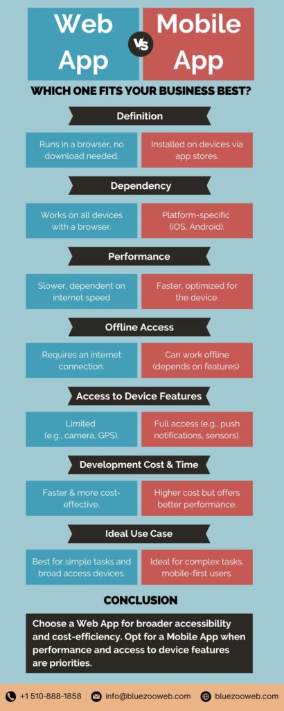
Infographic on Web App vs Mobile App: Which One Fits Your Business Best?What is a Web App?

A web app, or web application, is a software program that runs in your web browser and is accessed via the internet—just like visiting a website. Unlike a static website that simply displays content, a web app offers interactive functionality, allowing users to perform tasks like logging in, placing orders, or managing content in real time.

How Does a Web App Work?

Web apps are built using familiar web technologies—HTML, CSS, JavaScript, and often frameworks like React, Angular, or Vue.js. They run on remote servers and are accessed by users through browsers like Chrome, Safari, or Firefox.

When a user enters a URL, the browser sends a request to the server. The server processes it and returns the necessary content, allowing the app to display dynamically without needing to install anything on the user’s device.

Examples of Web Apps You Use Daily:

  • Google Docs: Google Docs is a web-based word processor that allows users to create, edit, and store documents directly in the browser. Multiple users can collaborate on a document in real time, making it ideal for teams.
  • Trello: Trello is a project management tool that operates in the browser. It allows teams to organize tasks into boards, making it easy to visualize workflows and stay on track.
  • Slack: Slack is a messaging platform designed for teams and businesses. While there’s a mobile app, the web app version allows users to chat, share files, and collaborate directly from a browser.
  • Canva: Canva is a messaging platform designed for teams and businesses. While there’s a mobile app, the web app version allows users to chat, share files, and collaborate directly from a browser.

Benefits of Web Apps:

Web apps supply a number of advantages:

  • No installation needed—instant access via URL
  • Cross-platform compatibility (works on any device with a browser)
  • Easy to maintain and update (changes go live instantly)
  • Cost-effective compared to building separate native apps

Web apps are a smart choice for businesses that want broad accessibility, lower costs, and quick deployment without the overhead of mobile app store submissions.

Downsides of Using Web Applications

While web applications have their advantages, they feature a few disadvantages:

  • Minimal Offline Performance: Web apps generally require an internet connection, making them much less beneficial in areas with poor connectivity.
  • Performance Constraints: Web applications typically don’t perform as swiftly or efficiently as native mobile applications, specifically for resource-intensive tasks.
  • Restricted Accessibility to Device Features: Web applications have actually limited ability to access device-specific attributes like GPS, camera, and push notifications, which can limit their capability.

The Function of an Application Development Company in Creating Web Applications

A trusted app development company in California can aid you in developing a web app that meets your business goals. With expertise in the most recent web technologies, such agencies can construct scalable, user-friendly web applications that satisfy your particular requirements. Whether you’re a start-up looking to get in the market or an established enterprise wanting to broaden your digital footprint, a specialist app development service provider can make your vision come true.


What is a Mobile Application?

A mobile app is a software application designed specifically to run on smartphones or tablets. Unlike web apps, which are accessed via browsers, mobile apps are installed directly onto your device—usually from an app store like Apple’s App Store or Google Play.

Mobile apps are built to take full advantage of device-specific hardware and features, such as GPS, camera, push notifications, offline access, and faster processing speeds.

But here’s where it gets more nuanced:
Not all mobile apps are created the same. They generally fall into two main categories—native and hybrid.

Common Examples of Mobile Apps:

  • Instagram: Instagram (a mobile-first social media app) uses device-specific features like the camera and push notifications, making it easy for users to share their moments instantly.
  • Uber: Uber (a ride-hailing app) relies on the mobile device’s GPS for real-time tracking and navigation, offering users a seamless way to book rides on the go.
  • Amazon: The Amazon mobile app offers users fast access to shopping, voice search, and barcode scanning, enhancing the overall shopping experience with mobile-specific features.

Native Mobile Apps

Native apps are developed specifically for a single operating system—iOS or Android—using platform-specific programming languages like:

  • Swift or Objective-C for iOS
  • Java or Kotlin for Android

Because they’re built for a particular platform, native apps are:

  • Extremely fast and responsive
  • Capable of leveraging all device features (like the camera, GPS, or sensors)
  • Visually aligned with the OS’s design standards (better UI/UX)

Example Native Apps: WhatsApp, Instagram, Uber

If performance, responsiveness, and full device integration are top priorities, native apps are the gold standard.

Hybrid Mobile Apps

Hybrid apps are built using web technologies like HTML, CSS, and JavaScript but are wrapped in a native container that allows them to run on both Android and iOS devices. Frameworks like Ionic, React Native, and Flutter are commonly used to build these apps.

Think of hybrid apps as web apps in disguise—they can be installed like a native app, but their core codebase is often shared across platforms. Want to see how emerging frameworks are shaping the mobile experience? Explore emerging trends in app development.

Advantages of Hybrid Apps:

  • Faster and more cost-effective to develop (one codebase for multiple platforms)
  • Easier to maintain and update
  • Ideal for MVPs or startups on a budget

Drawbacks:

  • Slightly slower performance than native apps
  • Limited access to some advanced device features
  • UI/UX may not feel 100% platform-native

Example Hybrid Apps: Twitter, Evernote (some versions), and many startup MVPs

When Should You Choose a Mobile App?

Opt for a mobile app when:

  • Your users expect to access your service via an app store
  • You need deep integration with the device (camera, push notifications, offline mode)
  • Performance and user experience are critical
  • You want to offer a more immersive, personalized experience

In short, mobile apps (native or hybrid) are best when your product demands speed, offline access, and direct interaction with the user’s device. While they require more investment than web apps, they often provide better long-term engagement—especially for consumer-facing brands.

How an App Development Agency Can Help with Mobile App Advancement

Working with one of the top app development agencies guarantees that the mobile application is created to the highest possible standard. Whether your need is for a cross-platform app that appeals to a larger audience or an indigenous app with advanced features, an experienced business will most definitely help you through the whole development process, from idea to final product.


Pros and Cons of Web Apps vs Mobile Apps

When choosing between a web app and a mobile app, it’s important to consider your business goals, budget, user needs, and long-term scalability. Each platform comes with its own advantages and trade-offs.

Let’s break them down:

Mobile Apps: Pros and Cons

Pros:

  • Superior performance and speed
  • Access to device features (camera, GPS, sensors)
  • Available offline
  • Better user experience (especially native apps)
  • Higher user engagement and retention via push notifications

Cons:

  • Higher development and maintenance cost
  • Platform-specific (iOS and Android require separate native codebases)
  • Needs approval from app stores
  • Requires ongoing updates and version control

Web Apps: Pros and Cons

Pros:

  • Accessible on any device with a browser—no installation needed
  • Faster and more affordable to develop
  • Easier to update and maintain
  • No app store approval required

Cons:

  • Limited access to device features
  • Requires an internet connection (typically)
  • Slower performance compared to mobile apps
  • Not as intuitive or polished in user experience


Web App vs Mobile App: Quick Comparison

Feature Web App Mobile App
Platform Dependency Cross-platform (browser-based) Platform-specific (iOS, Android)
Installation No installation required Requires installation from app store
Performance Generally slower than mobile apps Typically faster and more responsive
Development Uses web technologies (HTML, CSS, JavaScript) Uses platform-specific languages (e.g., Swift, Kotlin)
Development Cost Lower Higher
Offline Access Requires internet connection Can work offline (depending on design)
Device Integration Minimal Full access to device features
User Experience (UX) Basic to moderate Advanced and responsive
Access to Device Features Limited access Full access to device features
Offline Access Requires internet connection Can work offline (depending on design)
Updates Instantly via server Requires user download from app store
Time to Market Faster Longer (especially for native apps)

Which One is Right for You?

  • Choose a web app if you want to quickly reach users on multiple platforms with lower development costs.
  • Choose a mobile app if performance, personalization, or device-level access is essential for your user experience.

In many cases, businesses start with a web app and later invest in a mobile app once their user base grows or specific mobile functionality becomes a priority.


Key Differences Between Web Apps and Mobile Apps in Action

Understanding the technical and experiential differences is important—but seeing how brands apply them in the real world brings true clarity. Here’s how some leading companies leverage web apps and mobile apps based on their business models:

E-Commerce: Amazon

  • Mobile App: Amazon’s mobile app delivers a seamless, personalized shopping experience, complete with push notifications, barcode scanning, and 1-click purchases. It’s designed for frequent users who value convenience and speed.
  • Web App: The Amazon website remains robust and accessible to all users across devices, perfect for casual shoppers or those browsing on desktops.

Why both? To engage users at every touchpoint—mobile for retention, web for broad reach.

Travel: Airbnb

  • Mobile App: Airbnb’s mobile app allows users to book stays, communicate with hosts, and get real-time notifications. It uses device features like GPS and camera for smoother experiences.
  • Web App: Airbnb’s web platform is equally powerful and serves well for users planning trips on desktops or sharing listings.

Why both? Web for planning and larger screens; mobile for on-the-go convenience and instant booking.

Entertainment: Spotify

  • Mobile App: Spotify’s native mobile app offers offline listening, background streaming, and personalized playlists. The immersive mobile experience is key to its business model.
  • Web App: While a web player exists, it’s limited in features and primarily supports desktop use.

Why mobile-first? Mobile is the primary channel for user engagement in entertainment apps.

Productivity: Google Docs

  • Web App: Google Docs was born as a web-first application, emphasizing collaboration, autosave, and cloud access across browsers.
  • Mobile App: The mobile version is functional but offers fewer features due to screen and UX limitations.

Why web-first? Web supports multi-user collaboration and productivity in real-time.

Key Takeaway: One Size Doesn’t Fit All

  • Brands like Spotify focus on mobile apps for high engagement.
  • Companies like Google prioritize web apps for productivity and flexibility.
  • Leaders like Amazon and Airbnb embrace both, leveraging each platform’s strengths.

Your choice depends on where your users are and what experience you want to deliver—speed and reach with web apps, or deep engagement and native features with mobile apps.


When to Choose a Web App Over a Mobile App (and Vice Versa?)

Choosing between a web app and a mobile app isn’t just about tech—it’s about strategy. Your audience behavior, feature needs, budget, and timeline all influence which path is right for your business.

Below is a breakdown of when each platform is most appropriate:

Choose a Web App When…

Scenario Why a Web App Works Best
You’re just starting out Web apps are faster and more affordable to build, test, and iterate. Ideal for MVPs (minimum viable products).
You want maximum accessibility Users can access your app from any device with a browser—no downloads needed.
You’re focused on content or services Great for blogs, online tools, SaaS dashboards, booking systems, and educational platforms.
You have limited development resources One codebase for all platforms reduces maintenance and deployment costs.
You need SEO benefits Web apps can be indexed by search engines, boosting visibility and organic traffic.

Choose a Mobile App When…

Scenario Why a Mobile App Excels
Your product depends on native device features Need GPS, camera, offline access, or push notifications? A mobile app is essential.
You’re targeting high engagement Mobile apps often see higher user retention and repeat usage.
You plan to monetize through app stores Native apps are ideal for in-app purchases, subscriptions, and app store discovery.
Your users need real-time access Industries like fintech, rideshare, health, and social media thrive with native apps.
You want better performance and speed Native apps offer superior speed, responsiveness, and smoother animations for complex tasks.

Hybrid Approach?

In many cases, companies start with a web app, then add a mobile app as their user base grows. Some even build Progressive Web Apps (PWAs)—web apps that behave like native apps with offline access, home screen installation, and push notifications.

Summary: Your Decision-Making Checklist

Factor Web App Mobile App
Budget-Friendly
Quick to Market
SEO/Discoverability
Offline Access
Native Features (Camera, GPS)
Frequent User Engagement
App Store Monetization

Bottom Line:

  • Go web-first if you’re validating a concept or offering broad access.
  • Go mobile-first if your product hinges on device features or intense user engagement.
  • Consider both if your growth strategy spans multiple user touchpoints.

How Businesses Are Combining Both (Hybrid & Omnichannel Strategies)

Today’s digital winners aren’t picking just one platform—they’re integrating web apps, native mobile apps, and hybrid solutions into a cohesive omnichannel experience.

This strategy ensures users get a seamless journey—whether they’re browsing your site on a laptop or checking notifications on their phone.

Why Combine Web and Mobile?

Benefit What It Means for Your Business
Wider Reach Engage users wherever they are—on desktop at work or mobile on the go.
Better User Retention Web apps attract first-time visitors, mobile apps keep loyal users engaged.
Increased Revenue Opportunities Monetize via mobile in-app purchases and web-based eCommerce or SaaS plans.
Data Continuity Across Devices Cloud sync enables users to pick up where they left off, across platforms.
Brand Consistency Reinforce your brand experience consistently across all digital touchpoints.

Real-World Examples of Hybrid Success

  • Spotify: Offers both a robust web player and a deeply immersive mobile app, keeping users streaming across all devices.
  • Starbucks: Customers can browse the menu online, but order and pay via the mobile app with rewards integration.
  • Notion & Trello: Web-first productivity platforms that introduced powerful mobile apps for remote collaboration.


Popular Hybrid & Omnichannel Development Approaches

Strategy Description Best For
Progressive Web Apps (PWA) A web app that behaves like a native app—offline access, home screen icon, and push notifications. Startups, content platforms, lightweight tools
React Native / Flutter Cross-platform frameworks that use a single codebase to build both Android and iOS apps. Fast-moving teams, MVPs, internal apps
API-First Web & Mobile Apps Backend services power both web and mobile front-ends, ensuring shared data and features. SaaS platforms, finance tools, marketplaces

Omnichannel Strategy Checklist

Want to build an experience that spans both web and mobile? Here’s a quick planning guide:

  • Ensure your backend APIs serve both platforms equally.
  • Design responsive UI/UX patterns that translate well across screens.
  • Use analytics to track cross-device behavior.
  • Implement cloud sync so data is continuous across sessions.
  • Prioritize performance for both platforms (don’t make mobile an afterthought).

Bottom Line:

You don’t have to choose between a web or mobile app—you can (and often should) do both, especially as your business grows. Starting small with one and expanding into the other ensures that you evolve with your audience, not behind them.


Final Thoughts + How to Choose the Right Development Partner

Choosing between a web app, mobile app, or a hybrid strategy is less about following trends and more about aligning with your users’ behavior, business goals, and long-term scalability.

Whether you’re building your first MVP or scaling into an omnichannel powerhouse, the right development decision should always be customer-first and growth-driven.

Key Takeaways

  • Web apps offer cost efficiency, easy updates, and great reach—ideal for first-time launches or service-based platforms.
  • Mobile apps shine when you need performance, offline access, deeper engagement, or native features.
  • Hybrid models and omnichannel strategies allow you to balance both worlds—extending functionality and improving retention without starting from scratch on every platform.

What to Look for in a Development Partner

Choosing the right team can make or break your project. Here’s what to prioritize:

Must-Have Why It Matters
Platform Expertise Your partner should have a strong track record in web, native, and hybrid app development.
Strategy-First Approach You need a team that can guide you based on business goals, not just tech specs.
UX/UI Design Skills User experience drives retention—choose a partner that designs with real users in mind.
Cross-Platform Capability Look for developers who can build once and scale across platforms efficiently.
Post-Launch Support Ongoing updates, bug fixes, and improvements matter just as much as the initial build.

Ready to Build the Right App for Your Business?

Whether you’re leaning toward a feature-rich mobile app, a budget-friendly web app, or a flexible hybrid solution, your next step should be guided by clarity and expert insight.

Partner with a team that understands your business, not just your tech stack.

Request a Quote or Contact Us to discuss your app development goals with our experts.

Let’s turn your idea into a powerful digital product—built for performance, scalability, and growth.

How Web Design Impacts SEO?

Having a website is not enough in the digital era to draw attention and keep visitors. The main challenge lies in making your website easily discoverable through search engines, which is where SEO (Search Engine Optimization) comes into play. SEO is crucial in improving the visibility of your website, increasing traffic, and, finally, strengthening your company. However, many ignore the major part that contributes to the web designing process.

SEO and web design are closely related. The way your website is built could either improve or worsen your SEO performance. This article will look at the way various site design components impact SEO and explain why working with a qualified web design company is so important—especially in highly competitive regions like California.

The Role of Web Design in SEO

Infographic on How Web Design Impacts SEOWeb design goes further than just appearance. It covers all aspects of your website’s structure, including user interaction, site architecture, and navigation. These components are absolutely important for Google and other search engines to perceive and rank your website.

Site Structure: Collaborating with a website design company for small business owners can help build a site structure that enhances SEO performance and user experience. Collaborating with a top SEO company in California can help you establish a logical structure that search engines can easily crawl, resulting in better rankings. Suppose your website follows a logical framework, including well-defined categories and subcategories. In such a situation, search engines will be able to better grasp your material, thereby improving your chances of ranking.
Navigation: Simple and clear navigation helps SEO and user experience. Users who can quickly locate what they are seeking are more likely to stay on your website longer, hence lowering bounce rates—a factor search engines take into account while ranking websites.
Mobile Responsiveness: Having a mobile-responsive design is not optional given more people use mobile devices to browse the internet. Working with a web design service agency can ensure your website is mobile-friendly, boosting both SEO and user engagement. A mobile-friendly website guarantees that your website appears and operates on all devices, thus affecting your SEO results greatly.
User Experience (UX): Search engines give top priority to websites providing an excellent user experience. A website design company for small business needs to prioritize UX, as it directly influences SEO rankings and conversions. Search engine results will probably show your content if it has a neat, simple design that lets users explore, read, and engage with it easily. Hence, the design of your website can directly affect your SEO results. By working with an SEO agency in California, you can ensure your website is optimized to meet these standards, thereby improving your chances of ranking higher.

Working with a leading web design agency in California can assist you in creating an intuitive and easy-to-navigate site structure. This includes categorizing your web content, utilizing internal links to connect relevant pages, and producing an XML sitemap to help search engine bots navigate your site. A well-structured website makes it easier for users to find what they’re looking for and also boosts SEO performance.

Website Loading Speed

SEO depends significantly on the speed of loading a website. Search engines strive to give users with the best possible experience, including fast-loading websites. A slow website can frustrate users and drive them away, leading to higher bounce rates and poor rankings. Choosing the right web design service agency can ensure your website’s loading speed is optimized for better user experience and SEO rankings.

Image Optimization: One of the main culprits of slow-loading websites is large uncompressed photos. Optimizing images—reducing their size without compromising quality—will help your site load far faster.

Code Efficiency: Loading speed of your website depends on the code efficiency as well. Clean, well-structured code allows your website to load faster, which benefits both the user experience and SEO. Reducing the use of pointless plugins and scripts will assist to simplify your code and speed load times.

Check your website’s loading speed with the PageSpeed Insights tool to better grasp & understand how SEO may be impacted.

Mobile-Friendly Design

Having a mobile-friendly design is now absolutely crucial for SEO performance as the usage of mobile devices keeps growing. Particularly after mobile-first indexing was introduced, Google and other search engines give mobile-optimized websites top priority.

Responsive Web Design: A responsive web design makes sure your website appears attractive and runs well on all devices by adapting to fit various screen sizes. A website design company for small business can ensure your site is optimized for mobile devices, giving you a competitive edge in search engine rankings. This adaptability goes beyond appearances; it’s a critical component in enhancing SEO success. Especially in a region with a great degree of digital competition, a web design agency in California can help ensure your website is completely responsive.

SEO Performance: Websites without mobile friendliness are more likely to suffer from ranking. This is so because search engines are aware of users’ preference for easily navigable websites on mobile devices. Giving mobile-friendly web design a priority increases user experience and improves your chances of ranking better in search engine results.

Content Relevance and User Engagement

In the realm of SEO, content is king, but if it’s not presented properly even the best content can fail. Making your material relevant, interesting, and easily available to users depends critically on web design.

Layout: Your website’s design influences user interaction with your content. Users will be more likely to interact with your material if your layout is clean and emphasizes important information. This increased involvement can lead to more time spent on your website, which is a good indicator for search engines. Working with a leading web design firm like BlueZooWeb, for instance, would greatly improve the layout and general user experience of your website. Our method of design guarantees that every component, from layout to content presentation, is optimized to properly engage visitors.

Typography: Your text’s presentation determines user engagement as well as its visual appeal. Clear hierarchies of headings and subheadings, together with readable typefaces, help users understand your work. Users who find the content easy to read are more likely to stay on your webpage longer, thus enhancing your SEO results.

Multimedia: Including multimedia components, such as images, videos, and infographics, will help your work become more interesting. Still, it’s important to strike a balance between these components and website speed. While well-placed multimedia can improve user experience, cluttering your website will slow it down and compromise your SEO initiatives.

The Role of Backlinks and Crawlability

There are two key SEO components that are directly impacted by web design, which are backlinks and crawlability.

Internal Linking Structure A well-designed internal linking structure guides search engines toward the hierarchy and relationship between pages on your website. It also spreads link equity around your website, which could raise the page ranks individually.

URL Structure: Clean, clear, unambiguous URLs are more likely to be clicked on by users and more likely to be indexed by search engines, like Google. When you choose the right website design company for small business, they will ensure your site’s URL structure supports SEO efforts, making it easier for search engines to crawl and index.

Crawlability: Search engines can easily crawl and index a well-organized website. If search engines cannot efficiently crawl your site, it’s less likely that all your pages will be indexed, which can negatively impact your SEO. Minimal errors and well-defined sitemaps will help your website be easily navigable, enhancing crawlability.

Strategies for Optimizing Web Design for SEO

Utilizing SEO-Friendly Design Elements
Numerous websites have experienced substantial enhancements in their SEO performance due to the implementation of effective web design strategies. For example, a retail website that partnered with a web design firm to revamp its site structure, navigation, and content layout saw a 30% increase in organic traffic within three months. By optimizing your design for SEO, you can improve your site’s visibility and ranking on search engines.

Utilizing SEO-Friendly Design Elements
In order to keep your site optimized for both design and SEO, it is essential to conduct regular audits. By doing so, you can identify design issues that may be affecting your SEO performance, such as slow loading speeds, broken links, and poor mobile responsiveness.

Look for a web design service provider; they can help you conduct thorough audits. By promptly addressing any issues, you can maintain and improve your rankings on SERPs.

Collaborating with Web Designers and SEO Specialists
For the best results, it’s crucial to collaborate with both web designers and an experienced SEO agency in California. Together, they can create a cohesive strategy that enhances your website’s design while optimizing it for SEO.

This collaboration ensures that every aspect of your site, from layout to content presentation, is tailored to improve user experience and search engine visibility.

Conclusion

Web design is more than simply making a visually appealing website; it’s also about making a user-friendly, SEO-optimized site that ranks well in search engines. Paying attention to characteristics like site structure, navigation, loading speed, mobile friendliness, and content presentation will help you significantly improve your website’s SEO performance.

In today’s competitive digital market, associating with a leading web design agency in California that knows the value of SEO is critical. A well-designed website attracts users and keeps them engaged, therefore increasing your chances of converting those visits into customers. Emphasizing both web design and SEO can help you to have a strong online presence that generates traffic, interacts with consumers, and increases the profitability of your company.

Keep in mind that your website generally serves as the first impression of your business to potential clients. Make it count by ensuring it is both visually appealing and search engine optimized.

The Impact of Mobile-First Web Design on Business Growth

The Rise of Mobile Users:

Statistics on the dominance of mobile browsing: Mobile devices clearly rule internet access now. Actually, as cell phones become more available, more than half of the world’s web traffic now comes from mobile devices; this trend only keeps increasing. Realizing this change is absolutely vital for a web design agency.

User behavior on mobile: Mobile users exhibit rather different behavior. Shortening attention spans and a clear demand for simplified website experiences call for Users to want quick, easily navigable sites that fit for browsing while on the go.

Why Mobile-First Web Design Matters for Businesses:

Improved user experience (UX) and customer satisfaction: Customer satisfaction and better user experience (UX) from Using a mobile-first strategy guarantees that most of your audience will have a flawless experience. Higher user engagement and satisfaction follow from this, which are vital indicators for any company, but especially for one trying to be the best web design company.

Enhanced search engine ranking (SEO): Google and other search engines give mobile-friendly websites top priority in their rankings or SEO. Particularly in mobile search results, a mobile-first web design enhances the SEO of your website, thus improving visibility.

Advanced SEO Techniques for Mobile-First Indexing: Google has moved to mobile-first indexing, in which case it mostly indexes and ranks the content using the mobile version. For companies, particularly in tech-savvy areas like California, improving your mobile site using cutting-edge SEO plays a crucial role. Implementing schema markup, optimizing for local search, and enhancing mobile site navigation are pivotal to improving your online visibility.

Increased conversions and sales: A well-optimized mobile website significantly boosts the likelihood of conversions. Whether it’s signing up for more information or completing a purchase, mobile users are more likely to commit if the process is smooth.

Staying competitive in the digital landscape:  In today’s market, a mobile-first website isn’t just nice to have; it’s a necessity. Businesses need to adapt to stay relevant and competitive. The best web design company for small businesses that prioritize mobile can set you apart as a leader in the field.

Remember, in a tech-forward state like California, mobile-first isn’t just a trend; it’s the standard.

Key Principles of Mobile-First Web Design:

Responsive design vs. dedicated mobile apps: Understanding the advantages of responsive design is vital for any web design agency in California. Unlike dedicated mobile apps, responsive design guarantees your website runs fluidly across all platforms, boosting accessibility without the added expenditures associated with app development.

Prioritizing content and functionality: For organizations, especially those trying to stand out as the top web design companies, it’s necessary to streamline material and prioritize essential functions that match mobile consumers’ expectations. This method delivers a focused and efficient user experience.

Optimizing for touchscreens: Effective mobile-first design entails customizing user interface elements for touchscreen interactions. This includes making buttons larger and ensuring content is easy to see, which are practices every web design firm should grasp.

Fast loading times: Web design agencies must focus on site speed, especially for mobile visitors. Fast loading speeds are crucial for keeping visitors engaged and enhancing overall user satisfaction.

Interactive Elements for Enhanced Engagement: Interactive components like as on-click animations, hover effects, and interactive polls can dramatically enhance user engagement on mobile devices. These characteristics are sometimes ignored but may set a website designing business apart by offering an interesting, memorable user experience that drives longer site visits and higher conversion rates.

Security Features for Mobile Users: With the increasing frequency of mobile browsing, security has become a critical concern. Integrating modern security features, like two-factor authentication and secure mobile payment alternatives, reassures users and establishes confidence, a key component for any web design firm trying to win in the competitive Californian market.

Examples of Successful Mobile-First Websites:

Case Studies: Look at businesses that have effectively applied mobile-first web concepts. One well-known e-commerce site might explain, for example, how its mobile-friendly design has simplified buying experiences, therefore boosting user retention and sales. Often emphasizing important elements that improve the mobile user experience, these samples show streamlined navigation, fast load times, and good use of images.

Visuals: Including screenshots or brief descriptions of several websites will help to show what makes a mobile-first design successful. Emphasize aspects including neat design, easy-to-use interfaces, and general mobile user experience of these sites.

Performance Analytics and Continuous Improvement: Offers great insights when one tracks user behavior and site performance on mobile devices using mobile-specific analytics. Knowing how users interact with your site on mobile helps companies make investments in web design agency services to make constant adjustments, especially meant to improve the mobile experience.
This targeted strategy improves the practicality of your website and its success in highly competitive digital markets.
See how leading web design agency have effectively applied mobile-first concepts. Showing actual cases helps us to emphasize how well-designed mobile experiences affect user involvement and happiness.

Getting Started with Mobile-First Web Design:

For Businesses with Existing Websites: For Companies that currently have a website, switching to a mobile-friendly layout is absolutely vital. Use responsive design first to make sure your site fits many screen sizes. Design audits should also help you find and fix instances where the mobile usability of your site may be strengthened.

For Businesses Building a New Website: From the beginning of a new website’s planning, stress mobile-first design. This strategy guarantees that, for most of the customers who will visit your site using mobile devices, it offers an ideal experience.

Considering Professional Help: Working with a leading web design agency with experience will help you greatly ease the shift to a mobile-first approach. An agency adept in mobile-first design can provide priceless insights and use best practices to guarantee your website runs on mobile devices.

Additional Tips:

Visuals: Use images like infographics or screenshots throughout your work to keep readers interested and aid in simplifying difficult ideas.

Language: To make your material readable by a larger audience, eliminate too technical jargon and instead use straightforward, simple language.

Call to Action: End your piece with a strong call to action. Urge readers to investigate mobile-first web design or get in touch with your web design company for customized offerings.

Social Media Integration: Mostly accessed in the digital era, social media platforms are found on mobile devices. Including social media in your mobile-first website improves social sharing and interaction, boosting user engagement and traffic and establishing your firm as the top web design company in California.

Adaptive vs. Responsive Design: While responsive design is important, using an adaptive design approach whereby several site versions are developed for different devices can provide customized experiences that especially more specifically meet the demands of mobile consumers.

Training and Resources: Ensuring your team is knowledgeable in the most recent mobile web design trends and technologies is absolutely vital. Training and resources Attending industry conferences, keeping current with new tools and technology, and regular training courses will help your web design agency in California remain mobile-first design forward.

Conclusion

Any company seeking success in the digital era has to apply mobile-first site design. As mobile use rises, the mobile-first design guarantees that your website satisfies the needs of most part of your audience. This raises user experience, SEO, conversion rates, and corporate competitiveness.

Mobile-first web design transcends design that is simply mobile-friendly. Key are interesting, safe, quick experiences that satisfy mobile user expectations. Use this approach to enable sustainable development of your company in the digital era.

Remember, as one of the best web design companies in California, our responsibility is to keep ahead of the curve and guide our clients across the always-changing digital terrain.

Top Web Design Trends In 2024

As we move further into 2024, the web design landscape continues to evolve rapidly. Staying updated with the latest trends is crucial for any business looking to maintain a strong online presence.

I’m excited to share some of the top web design trends you can use on your website, explore the common trends dominating the industry now, and discuss the most important trends you should prioritize.

For a deeper understanding of how foundational elements can significantly impact your business, I recommend reading our article on The Timeless Power of Websites: Building Blocks for Business Success. This piece provides valuable insights into how a well-designed website can serve as a critical component of your business strategy.

Whether you’re working with a leading web design agency in California or handling your site in-house, these insights will help you stay ahead of the curve.

Design Trends You Can Use on Your Website

The world of web design is dynamic, with new trends emerging to enhance user experience and engagement. Here are some innovative design trends you can implement on your site:

1. Dark Mode:

Dark mode has become increasingly popular due to its sleek appearance and reduced eye strain. By offering a dark mode option, you cater to users who prefer this setting, enhancing their overall experience.

2. Neomorphism:

This trend combines skeuomorphism (Skeuomorphism is a design concept in which digital interfaces and objects imitate the appearance and functionalities of their real-world counterparts. Eg:- “Calculator” app in, which is designed to look like a physical calculator) and flat design,creating a soft, almost 3D effect that adds depth to elements like buttons and cards. It’s visually appealing and modern, making your website stand out.

If you’re a small business looking for affordable website options, consulting a website design company for small business might be the perfect first step.

3. Micro-Interactions:

Small animations that occur in response to user actions, such as hovering over a button or scrolling, can make your website feel more interactive and engaging. These subtle touches can significantly improve user experience.

4. Voice User Interface (VUI):

With the rise of voice assistants, integrating VUI into your website can provide a hands-free navigation option. This is especially useful for accessibility and convenience, catering to a broader audience.

5. 3D Elements:

Incorporating 3D visuals can make your site more engaging and memorable. Whether it’s 3D product images or interactive elements, this trend can provide an exceptional user experience.

6. Artificial intelligence and chatbots:

AI-driven chatbots can enhance customer service by providing instant responses and assistance, even outside of business hours. This trend improves user satisfaction and can help convert visitors into customers.

Website Design Trends That Are Now Common

Some design trends have gained traction and become widely adopted across various websites. These trends are essential for creating a modern and user-friendly site.

1. Minimalism:

Less is more in web design. For many small businesses, finding affordable website solutions that don’t sacrifice quality is essential—look into small business web design services that fit your needs. MINIMALISTIC websites with clean layouts, ample white space, and simple navigation make it easier for users to focus on content and navigate the site.

2. Mobile-first design:

With more people accessing websites via mobile devices, mobile-first design is crucial. This approach ensures your site is fully optimized for mobile users, offering a seamless experience across all devices.

3. Asymmetrical layouts:

Breaking away from traditional grid layouts, asymmetrical designs create a dynamic and visually interesting user experience. This trend allows creative freedom while maintaining balance and harmony on the page.

4. Custom illustrations:

Unique, hand-drawn illustrations add a personal touch to your website. They can help convey your brand’s personality and make your site more engaging and relatable.

5. Bold typography:

Using large, bold fonts can make a strong statement and improve readability. It’s a powerful way to highlight key messages and guide users through your content.

6. Video backgrounds

Video backgrounds can make a strong impression and convey complex messages quickly. When used correctly, they can add a dynamic element to your homepage and engage visitors right from the start. Just ensure that videos don’t slow down your site’s loading speed.

7. Sustainability and Green Design

Sustainability is a growing concern, and it’s influencing web design as well. Green design practices, such as optimizing images to reduce energy consumption and using eco-friendly hosting services, are becoming more common. Demonstrating a commitment to sustainability can enhance your brand’s reputation.

What Are the Most Important Web Design Trends?

While many design trends can enhance your website, some are particularly crucial for staying competitive:

1. Accessibility:

Ensuring your website is accessible to all users, including those with disabilities, is not only ethically important but also beneficial for SEO. Features like keyboard navigation, screen reader compatibility, and alt text for images are essential.

2. Page speed:

Fast-loading pages are critical for retaining users and improving SEO. Optimizing images, leveraging browser caching, and minimizing code are some ways to enhance page speed.

3. Personalization:

Tailoring content to individual users based on their behavior and preferences can significantly enhance user engagement and satisfaction.Personalized recommendations and dynamic content are powerful tools in this trend.
Working with a leading web design agency can ensure that your website is designed to effectively capture the essence of your brand, making it unique and engaging.

4. Cybersecurity:

With the increasing number of cyber threats, securing your website is paramount. Implementing SSL certificates, regular security audits, and strong data protection measures build trust with your users.

5. Sustainable Web Design:

Eco-friendly web design practices are gaining attention. This includes optimizing websites to reduce energy consumption and adopting green hosting solutions.

6. Optimize Loading Speeds:

Ensuring your website loads quickly can significantly improve user experience and SEO. Techniques such as image compression, code minification, and using Content Delivery Networks (CDNs) can help achieve this.

7. Improve SEO:

SEO remains a critical aspect of web design. Implementing best practices such as keyword optimization, high-quality content, and backlinks can help your website rank higher in search engine results, driving more organic traffic.

8. Voice search optimization

With the rise of smart speakers and voice assistants, optimizing your website for voice search is crucial. This means using natural language in your content and ensuring your site can easily be navigated via voice commands. Voice search optimization can help you reach a broader audience.

How to Improve Website Performance

Improving your website performance is essential for delivering a positive user experience and boosting your search engine rankings. Here are some practical tips to get you started:

1. Optimize images:

Large images can slow down your site. Compress images without sacrificing quality and use appropriate file formats like WebP for better performance.
If you’re a small business looking for an affordable website for small business needs, streamlining the image optimization process can help you boost performance without compromising on design.

2. Use a Content Delivery Network (CDN):

A CDN can distribute your content across multiple servers worldwide, reducing load times for users by serving content from a server closest to them.

3. Minimize HTTP Requests:

Reduce the number of elements on your page that require HTTP requests, such as scripts, images, and stylesheets. This can speed up your page loading times.

4. Leverage Browser Caching:

Browser caching stores static files, so they don’t need to be loaded whenever a user visits your site. This can significantly improve load times for repeat visitors.

5. Optimize Your Code:

Ensure your HTML, CSS, and JavaScript code is clean and efficient. Remove unnecessary code, minify files, and use asynchronous script loading.

6. Enable Compression:

Use Gzip or Brotli compression to reduce the size of your files, making them faster to load.

7. Regularly Update Your Site:

Keep your website’s software, plugins, and themes up to date to ensure optimal performance and security.

8. Monitor Performance:

Use tools like Google PageSpeed Insights, GTmetrix, and Lighthouse to regularly monitor your website’s performance and identify areas for improvement.

9. Regularly Update Content

Fresh and relevant content is crucial for maintaining user interest and improving SEO. Regularly update your blog, add new case studies, and keep your audience informed about your latest products or services. This shows that your business is active and engaged.

Conclusion

Keeping up with the latest web design trends is essential for maintaining a competitive and engaging online presence.

Whether you’re looking to incorporate innovative design elements, adopt common trends, or focus on the most important aspects of web design, staying updated will benefit your site. For small businesses seeking affordable website solutions that also offer cutting-edge features, working with a website design company for small business is key.

Working with the best web design company in California can help you achieve these goals, ensuring your website looks great and performs exceptionally well.

For creative ideas and inspiration, explore these brilliant web design examples here.

If you’re seeking top-notch web design services in California, choose a reputable web design agency that understands your needs and can deliver outstanding results.

Responsive Web Design Best Practices and Common Mistakes

Responsive web design isn’t just a trend; it’s a necessity in today’s digital world where users interact with various screen sizes daily. In California, as a web designer, I’ve witnessed how the shift to mobile-first strategies has impacted businesses. Here at our web design agency in California, our focus is on creating websites that not only look good but also function well on all devices. Let’s look into what responsive web design is, why it’s critical, and how you can apply it effectively while avoiding common mistakes.

1. Introduction to Responsive Web Design

So, what is responsive web design exactly? Essentially, it’s about making websites adaptable to look and perform well on any device, whether it’s a large desktop screen or a small smartphone display. As a leading web design agency, we understand the challenges of creating responsive websites that not only function across all devices but also deliver a seamless experience. Whether you’re a small business or a large enterprise, our small business web design services ensure that every design adapts perfectly to your target audience’s needs. This involves using various layouts, images, and CSS media queries to adjust the website’s structure to different viewing environments. This adaptability enhances user experience and improves SEO, which are both key priorities for any business. As a provider of web design services in California, ensuring this adaptability is a fundamental aspect of our development process.

2. Best Practices for Responsive Web Design

Infographic on How Web Design Impacts SEO
Fluid Grid Layouts
The old fixed-width layout is out of style. Fluid grid layouts use percentages instead of pixels to size web page elements. This means elements adjust in size based on the screen. Web design agencies in California often use this to keep things in proportion, no matter the device.

Flexible Images and Media
Images and media should scale with the layout, just like the grids. It’s important to make sure images resize properly to prevent layout issues. Simple CSS tricks help images fit their containers, avoiding any problems.

Media Queries
Media queries are a smart CSS tool. They let you apply CSS based on specific conditions, like screen size. By using media queries, you can tweak styles for different devices, which is essential for responsive design. It allows you to control how your site looks without changing the content itself.

Mobile First Approach
In a world full of mobile devices, designing for mobile first makes sense. Start small and expand for larger screens using media queries. This strategy focuses on speed and performance for smaller devices while ensuring all versions of the site are user-friendly. Our web design agency in California uses this approach to ensure all site elements are optimized across devices. For small businesses, affordability and functionality are key when selecting a responsive design strategy. With our affordable website for small business solutions, we ensure that each design is both budget-friendly and highly efficient, giving small businesses the competitive edge they need in today’s mobile-first world.

Accessibility Considerations
Accessibility should be a top priority. Make sure your website is usable for everyone, including those with disabilities. This means clear navigation, readable text, and good color contrast. An accessible site not only meets standards like WCAG but also offers a better experience for all users. Our web design services in California focus on compliance with standards and enhancing user experience for every visitor.


3.
Common Mistakes in Responsive Web Design

Despite the best intentions, several common mistakes can derail even the most well-planned responsive designs.

Overusing Media Queries:
It can be tempting to heavily rely on media queries to fix every design issue across devices, but this can lead to overly complex and hard-to-maintain code. As a leading web design agency in California, we recommend focusing on the core elements that need to adapt and using media queries sparingly.

Ignoring Performance:
Responsive sites must be optimized for performance, particularly on mobile devices. Neglecting aspects like image size and script loading times can considerably affect your site’s speed and user experience.

Fixed Measurement Use:
Using fixed measurements (like pixels for margins and padding) can cause elements to overflow on smaller screens, leading to a broken layout. Instead, use relative sizes to keep your design fluid and adaptable. Another mistake we often see is neglecting the importance of an affordable website for small businesses. As a leading web design agency, we advise businesses, particularly small businesses, to adopt flexible, scalable designs that grow with them. This approach makes sure they avoid overspending while staying ahead in a rapidly changing digital landscape.

Poor Testing Practices:
Adequate testing is critical. Many designs are tested only on a few devices or via simulators. World-device testing is invaluable and often reveals issues that simulators can overlook, something we emphasize at our web design agency in California.

Neglecting User Experience on Small Screens:
It’s easy to focus on the aesthetic aspects and neglect the practicalities of how easy it is to interact with your site on a small touchscreen. Making sure that tap targets are large enough and that the site is navigable with a finger rather than a mouse pointer is essential.

Implementing responsive web design is about understanding these best practices and common mistakes. As a leading web design agency in California, we consistently refine our approach to ensure our clients’ websites are not only responsive but also engaging and effective at meeting business goals. This approach doesn’t just create a website that looks good; it crafts experiences that resonate with users across all devices. Whether you’re just starting out or looking to improve an existing site, keeping these principles in mind can help you succeed in today’s mobile-first world.

4. Tools and Resources for Responsive Design

Creating a responsive website can be manageable with the right tools and resources. As a web design agency in California, we use various tools to simplify the design process and ensure our clients’ websites are optimized for every device. Here are some essential tools and libraries that can help in the design and testing phases of responsive web development:

Design and Development Tools

Bootstrap:
Bootstrap is an open-source toolkit that is popular for developing responsive, mobile-first projects. It offers ready-to-use components that are responsive by default.

Foundation:
Similar to Bootstrap, Foundation is a responsive front-end framework that simplifies the design of beautiful responsive websites, apps, and emails across all devices.

Adobe XD:
Adobe XD is a tool for designing and prototyping user experiences for web and mobile apps. It includes responsive resize functionality to automatically adapt UI elements for different screen sizes.

Sketch:
Sketch is known for its simplicity and is a design tool focused on user interface design. Its plugins and integrations with other tools make it a great choice for designing responsive interfaces.
When building affordable websites for small businesses, we rely on tools that allow us to create cost-effective yet high-performing designs. As a leading web design agency, we prioritize tools that help streamline the process while ensuring responsive, scalable, and visually appealing results for businesses of all sizes.

Tools for Testing and Debugging

Responsinator:
Need to see how your website looks on different devices? Responsinator gives you a quick peek without actually testing functionality.

BrowserStack:
For a more thorough check, BrowserStack lets you test your site in various browsers and devices, providing world-time results.

Chrome DevTools:
Chrome’s built-in DevTools allow you to simulate different devices and resolutions, making it easier to design responsively.

Optimization Tools

TinyPNG:
Reduce image file sizes without losing quality using TinyPNG, which helps speed up load times on mobile devices.

Google Pagespeed Insights:
Get recommendations for improving your site’s speed and performance on mobile devices with Google Pagespeed Insights.

Conclusion

Responsive web design is a must in today’s mobile-focused world. It’s a key part of web design that impacts user experience, SEO, and the overall success of any online platform. Being a web design agency in California, we know how essential it is to take a mobile-first approach, using fluid grids, flexible media, and accessible design principles to create custom websites that work well on all devices.

However, it’s important to avoid common mistakes like relying too much on media queries, not optimizing performance, and not testing thoroughly on world devices. By following best practices and using the right tools, anyone from solo developers to large web design agencies can make responsive designs that look good and work well.

We urge all businesses to adopt these responsive web design principles. Whether you’re creating a new site or updating an existing one, remembering these guidelines will help ensure your site offers a great user experience and ranks high in search engines. If you need help, consider contacting a trusted web design agency in California. We’re here to guide you through responsive web design and make sure your site not only meets but exceeds modern user expectations.